📊 Analytics
This section dissects data and depict them as graphs or aggregate them based on certain criteria. This provides the organizer with the statistics needed to analyse the entire event. Currently, the analytics section has been broadly split into four subsections
Overview
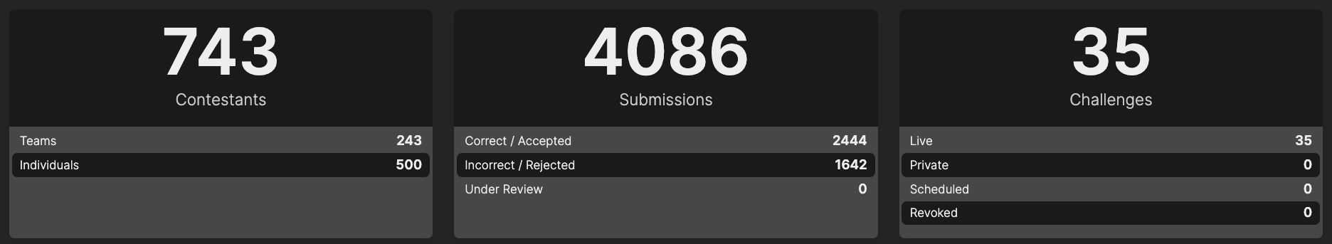
This section provides a quick overview of the event.
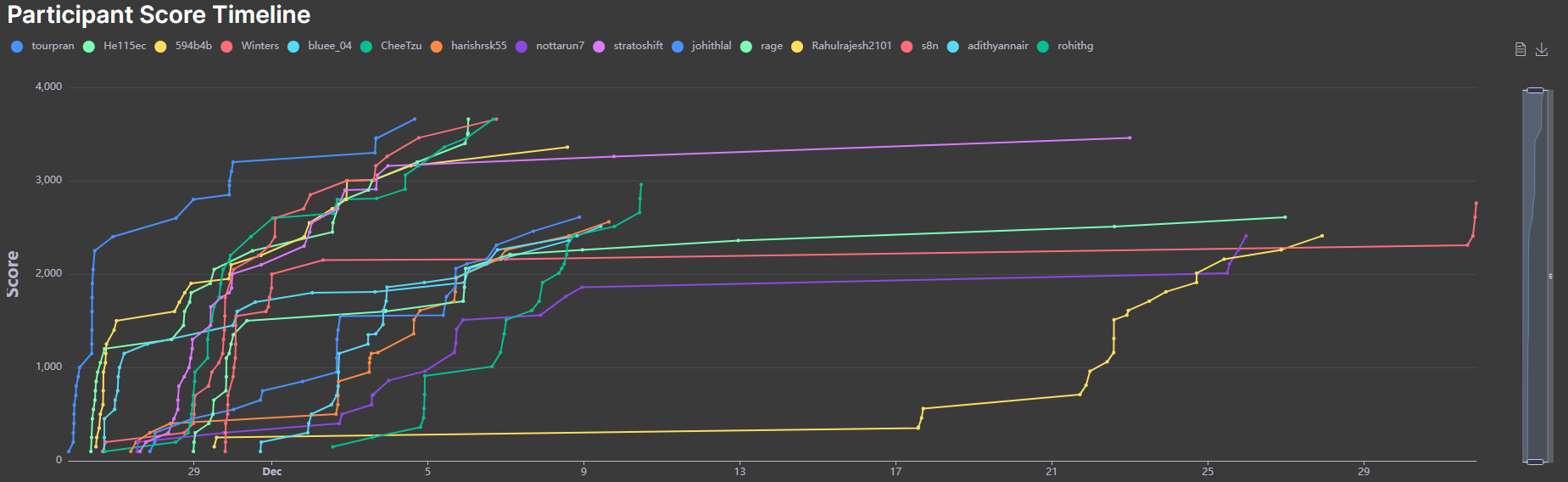
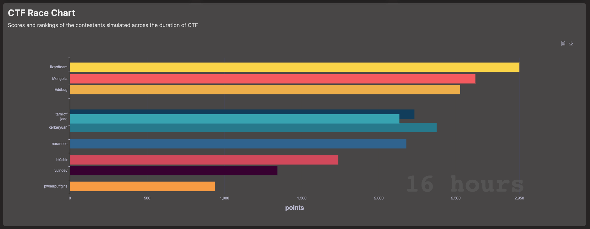
It also features a race chart graph, which is an animated bar chart that shows the rankings and score of participants across the duration of the CTF.
Challenge
This section provides a detailed analysis of the challenges.
On the top, it shows the most solved, least solved and the most valuable (i.e with most points) challenges.

| Chart | Description |
|---|---|
 | Most PopularChallenges having the number of solves - most correct submissions of flags. |
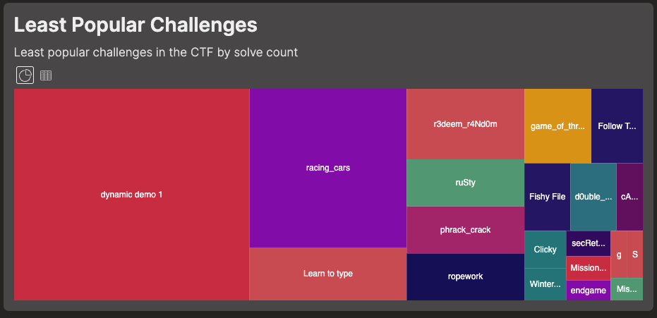 | Least PopularChallenges having the least number of solves - least correct submissions of flags. |
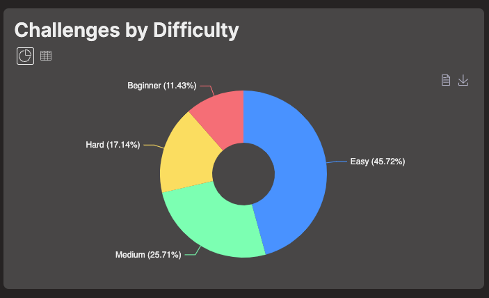 | By DifficultyView distribution of challenges by difficulty level on a pie chart. |
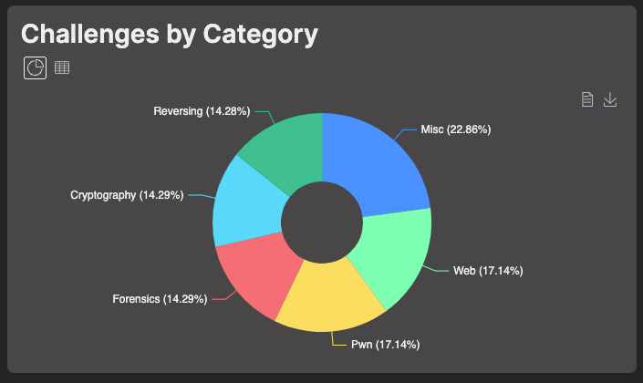 | By CategoryView the distribution of challenges by category on a pie chart. |
Submissions
This section provides a detailed analysis of the submissions.
| Chart | Description |
|---|---|
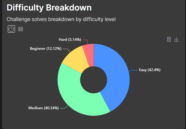 | Breakdown By DifficultyShows the number of challenges solved for each difficulty level. |
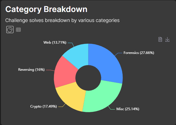 | Breakdown By CategoryShows the number challenges solved for each category. |
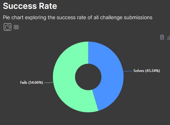 | Success/Failure PercentageShows the success and failure percentage across challenges. |
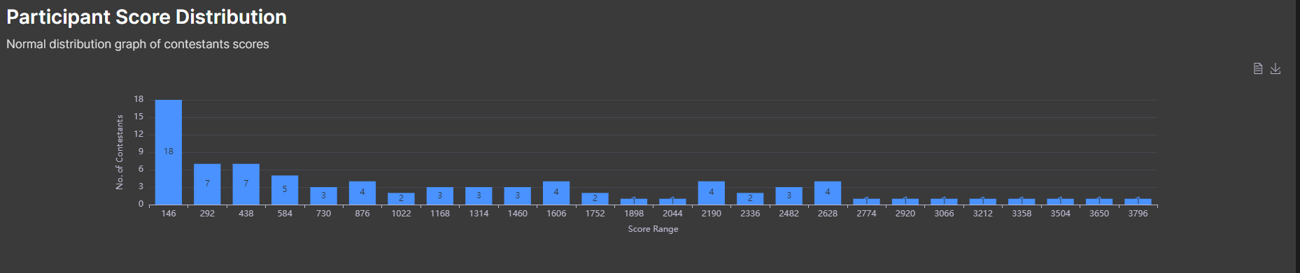
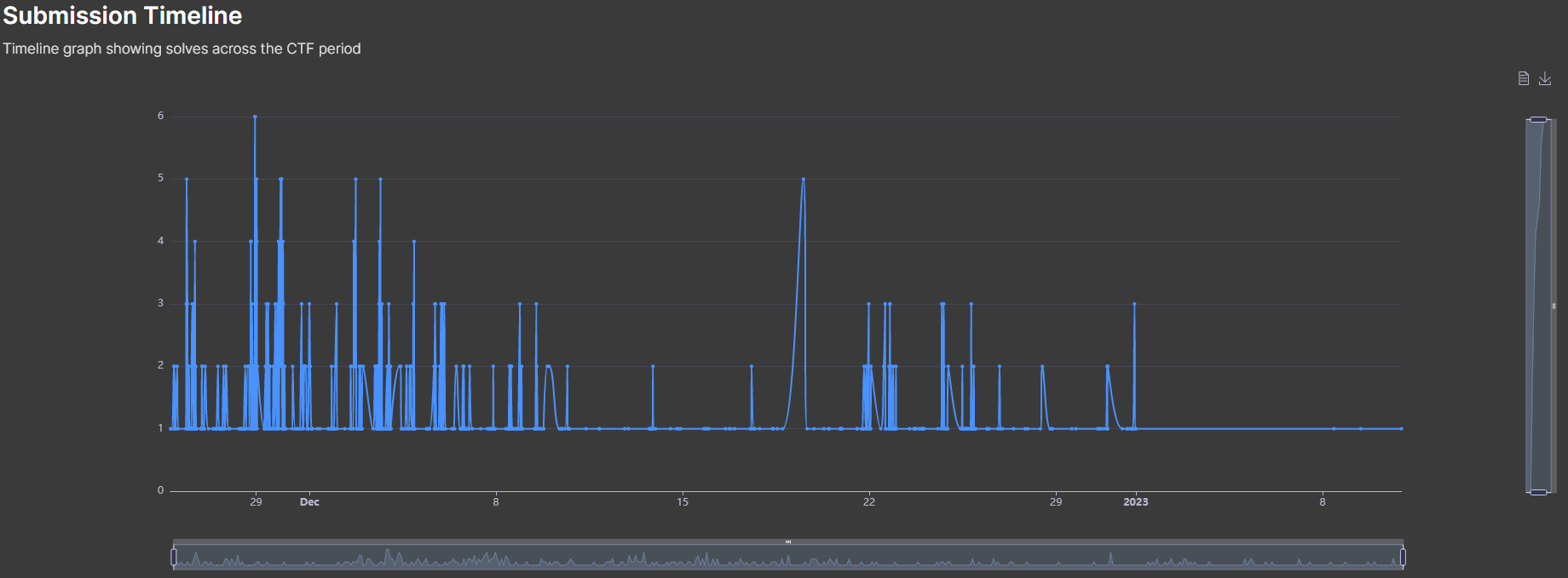
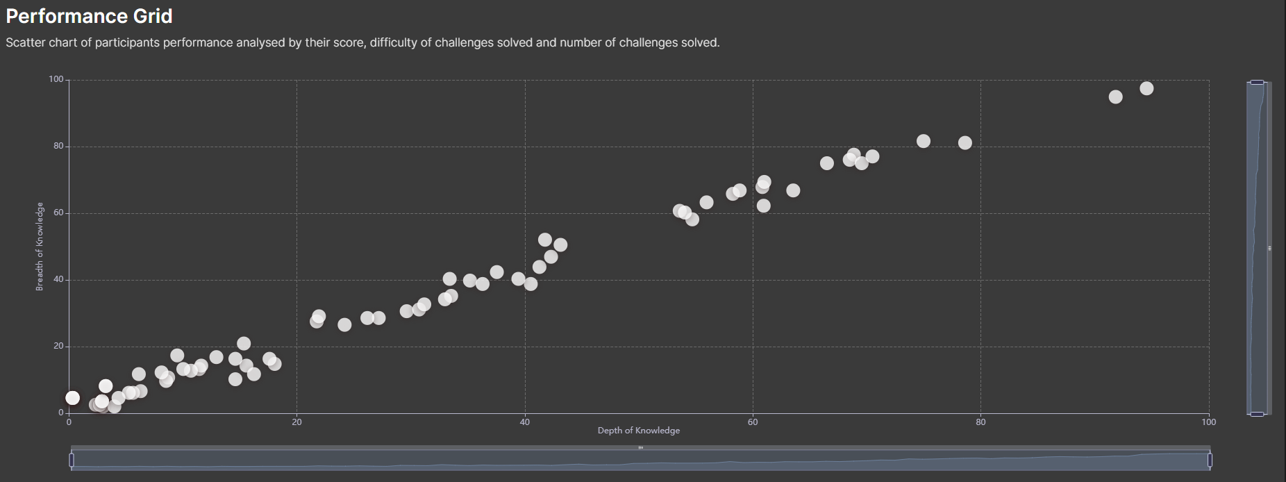
Participants
This shows top participants, submission timelines and how a particpant fared throughout the event.